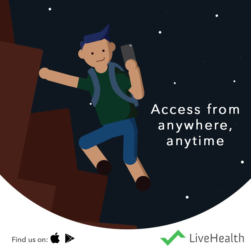
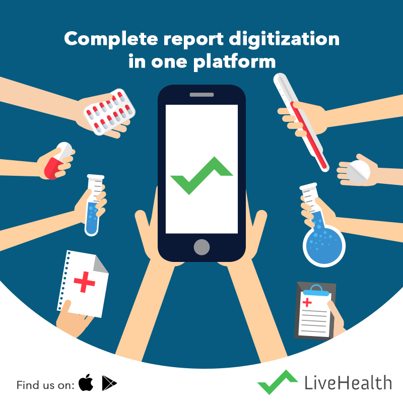
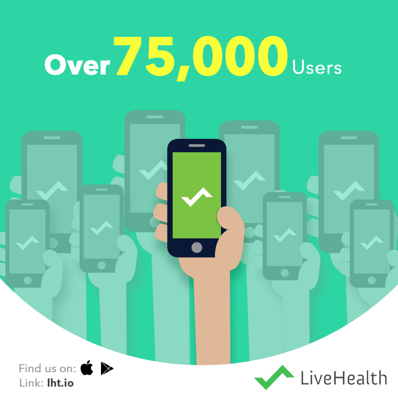
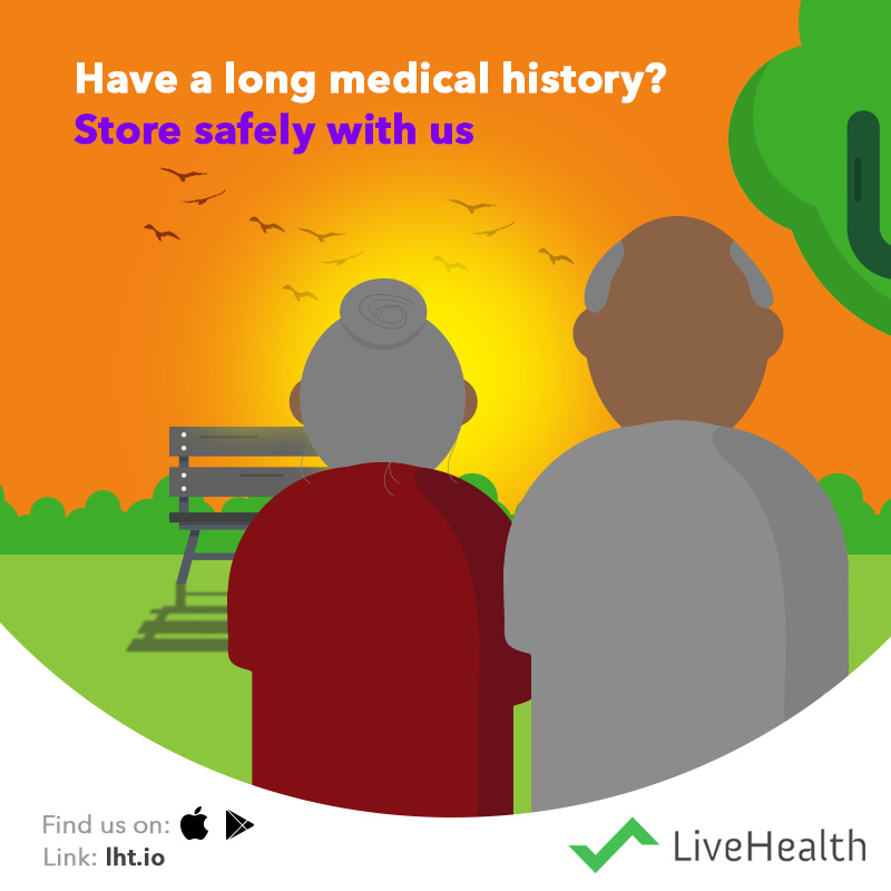
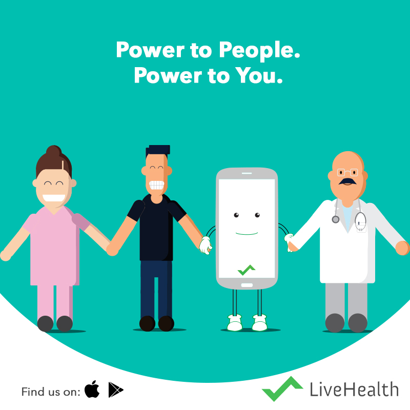
The first need defined was for a visual identity system that could be extended on digital and other platforms which was consistent and unified. At the same time, we did not want to go the normal way of using images like other healthcare brands. To break the clutter, we created a series of illustrations backed by a colour system, typefaces and a tone that was friendly and supportive, like the brand.
Once the visual communication was implemented, the next step was to launch a campaign backed by a series of content pieces that spoke about the brand, its offerings and benefits to people. Small bursts of topical campaigns were introduced to support the existing content strategy.
